Friday, 10 July 2015
test horror trailer [unit 11 1.1/1.2]
These are some of my screen shots of the process of how i made the test trailer that mr cleaves gave me as to edit.
My teacher handed over some footage so i could edit and get the feel for editing a horror trailer
in the stages i discovered what worked better with the theme and what hues to use.
adding the right transitions was a task to as the video will not look right without one.
Wednesday, 8 July 2015
Tuesday, 7 July 2015
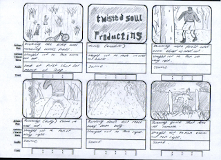
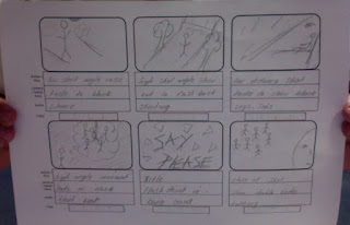
story board [unit 11 3.1]
- to conclude the section of the module a story board had to be drawn out to show a preview of what the trailer will look like but also to give me a plan to go off of when it comes down to filming the trailer and editing it.Ive created the best i thought i could come up with plan to have as an start ,middle and a end which is to have the bad situation happening at the start and in the ,middle have the persons life getting better building up to a climax where the person gets killed and ends up with the person hunting the bullies down and getting revenge back on them which isn't a happy thing but in the moment the viewers capture it as being good because of what these people put the other through.
Friday, 3 July 2015
survey feedback for trailer poster [unit 7 5.1] (unit 8 4.1 )
- for the first question i asked [would you go watch the movie after seeing the poster ?]= a lot of people put [maybe] i think this is because the poster doesn't stand out as much as it would to boys than girls.
- the second question i put [do you think the black and white worked?]=most people put yes i think i ask this question because from my part the black and white worked so i wanted to see if people agreed.
- 3 question i ask was [what would you rate this poster at?]=all the people put 4 out of 5 which is good but that lets me know there is still work to be improved.
- four is [do you think you would recommend the film after seeing this poster ?]=they put yes so that lets me know that i got the end result.
- 5 was [what age group does the poster look like it suits ?]=most did put 15-18 which was the target audience i was going for.
- last question i put in a description box for the viewer to write there thoughts on when they saw the poster?] they mostly put very good to the eye and improve on making it eye catching.
poster survey review feedback(unit 8 4.2/4.3)
WHAT WENT WELL : The aspects that went well was that people would watch the film after seeing the poster.Also they thought that the editing overall worked well.
WHAT TO IMPROVE : The aspect in which the poster needed to be better was the raw photos brightness plus from the feedback i can tell by editing a couple of thing or learning more skills in Photoshop will increase my overall rating.
WHAT TO IMPROVE : The aspect in which the poster needed to be better was the raw photos brightness plus from the feedback i can tell by editing a couple of thing or learning more skills in Photoshop will increase my overall rating.
Thursday, 2 July 2015
poster survey [unit 7 5.1]
- I have made 6 questions on survey monkey to ask people in my media class to see if there is any negative feedback in which then i can change about my poster and all round make it better.
- there are a lot of yes and no questions so if people are in a rush they can still fill it out.
Subscribe to:
Comments (Atom)


