Thursday 25 June 2015

shoot angles [unit 8 /2]

looking up view:


looking down view:


3rd person view:


macro close up view:

Tuesday 23 June 2015

Finished bullied poster [unit 8 3.3]


  • I finished this and as my poster i will use for my trailer .
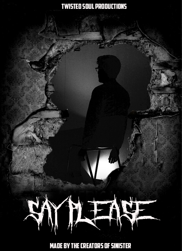
  • I started off with the raged wall with the whole in the wall then went on to take a photo to fill in the blank space.
  • The way i took this picture is i used my iPhone to make a backing light to shine up onto mr cleaves then taking the photograph from a kneeling position.
  • i added these to parts of my poster into photoshop and both made them black and white.I think this adds a more sinister view of it.
  • I then put them together with the later of the wall on top and then photograph be hide.
  • the original poster of the wall got cropped to make that whole for my picture to fit in then i went on to black out all the original words on there which i went on to replace with my own SAY PLEASE as the title TWISTED SOUL PRODUCTIONS our company name and MADE BY THE CREATORS OF SINISTER to give it a more authentic look.
PROS:The cropping went well as the blacking out the original words to replace with mine .
the black and white work really well on both images and made it that bit more horror.
CONS:fitting the photograph with the wall layer in front, And positioning the photograph with the wall. Trying to find a wall that looked scary plus to fit with my poster idea was hard.


Poster photo shoot and Photoshop editing [unit 8 2/3.1/3.2]


So through these images they have been changed on Photoshop and i have used screen shot images to show the stages of them.
After these i will contribute them to my finished poster they will back as a set background and then i will add a raged wall in front and add text to make the poster authentic.

Friday 19 June 2015

progress stages Photoshop [unit 8 1.1/1.2]

In this snap shot i used the black and white filter to darken the image and give the picture more texture which worked well as it high lighted the face i.e eyes there making the image much more sinister looking.
In this image i am just showing the before so that you can see the contrasting images and the ways i changed them both.


These four screen shots 
show the stages of my Photoshop with adding black and white and gradient tool.I think them two tools work the best to create a sinister poster.Plus with her eyes i added a color match with the black and white to add to her eyes.

Wednesday 10 June 2015

test posters [unit 8 2/3.1]


  • Ive used two images to put in photoshop then edited them with a gradient tool with a black and white layer to add with  contrast.
  • And then the photo with Rory facing the camera i used gradient and black and white tool.Then used a repeat tool to add the background as Rory swell so you have two images of him over lapped.

Tuesday 9 June 2015

horror poster fonts [unit 8/ 2]


  • These are my five best ideas fonts for the title of our poster.
  • After own meeting we have now chose one one what says say please.
  • This is because we think it resembled our poster the best.

Friday 5 June 2015

Horror idea fonts


  • So I've picked these five fonts starting with a hard to view font and ager the last poster i will use a much opening font to keep the desperation with to keep viewing the horror movie.

horror poster/drawn plan


  • This is my draft drawing of what I'm going to be making my horror poster like.
  • Ive constructed the base of the poster to have some of the common feature that a real published Horror poster would have.Eg.star rating and coming out soon or hashtags of directors and writers of the movie.

Horror poster/photoshop plan


.In this poster I've layered two published horror posters and cropped out the centre of one to reveal the person sitting on the chair.